
Hassle-free cab services for every taste and budget
Overview
City ride user research and UI for android mobile app. City ride was a concept project for a logistic client. The project was made to understand the current user needs in a metropolitan city.
The primary goal of the project.
They wanted to see how User experience design can help them understand the core issue while giving them a final concept by addressing a few pain points and understanding the return on investment.
What was the purpose of the project?
To address major pain points and find the opportunity to differ from a competitor and find ways to understand current Issues in-cab service sector.
Problem

-
Insisting on coming to other pick up point for their convenience
-
No direct call feature as it can be very overwhelming for old users to book a cab from the app sometimes, and it develops a feeling of discouragement and helplessness in this mobile service era.
-
Lack of women driver in the night or no option for women drivers

-
No option for assistance for users with special needs,
-
The sudden hike in prices for the same destination due to high demand on certain days, increasing the cost of travel for users
-
Loss of time while comparing rates in different cab service apps
What we are trying to learn and what is the solution
The issue was the majority with cost and security. Most people used public transportation, but the consumers lost time and could not get a cab at midnight. Well, it's cost-effective, but it does come with comfort and leisure.
Users like students and Professionals who travelled to and fro to the same place every day wanted deals or cheap rates, and few users like women wished to have women drivers as it created unconscious stress while travelling at odd times.
Users wanted more control over the time and money they spend on cab services.
7% to 9%
Average epicentre off salary in can service
My role - User research and conceptual UI
I was in charge of all significant UX deliverables, such as end-to-end user flows and delivering a working prototype in Invision.
I started with Initial field studies like informal interviews. I talked to people in the cab while pooling by asking them what kind of problems they face and what they want more in the car renting an area, which was the key to knowing the problems.
Responsibility
Discovery, Ideation, concept creation
Timeline & output
2 weeks to design and conduct research
Team
Project coordinator
and myself
We were also trying to prove user experience for this project to make stakeholders understand how these finding will have an impact on the product and can be beneficial for business.
Some proven ROI
The value proposition is linked to interventional trigger to user
Reduce development time
Increase customer satisfaction
Increase customer satisfaction
User research
Defining the user
I decided to keep a time frame of 1 week for each part of the process (research, design, prototyping ). Because of this, we only had time to do a couple of interviews and demographic research.
Users were majority students, working professionals and old age living in a metropolitan city. I conducted ethnographic research to gain insights into how users interact with cab services in their natural environment and took 15 User interviews who used cab services regularly in everyday life.
Some interview Insights.
Sujata: usually takes 80 Rs for my destination where I commute regular, but suddenly the cost rises to more than 150 rs at high demand hours, and I may have to walk a lot to get into public transport or pay more for the same destination.
Kumar: Driver arrives at the wrong location or crosses the road, no assistant option for older adults. I make my granddaughter book a cab for me. It is frustrating. I feel technology is only made for young people very concerning.
Rahul: Riders expected cab services to do their work instead of insisting them to conveniently come to another pickup place. If I am paying so much money, then why should I go.
Susan: I keep comparing prices because who doest want cheap, but it kills time hope there should be women driver too it will be good, right? I know a few friends of mine who travel alone at night hope it happens soon. It is its gender-specific role?
Competitive analysis
I compared the top used apps in the market and categorized the functions they have into 14 categories and also add the nice to be or desirable against the city guide.

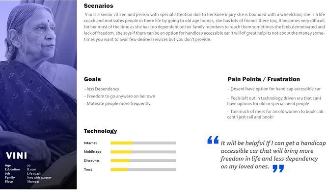
Persona
We finalised three personas representing the behaviour and user need of working professionals, student and old aged.
The persona was to incorporate all of our research into a more empathetic user and prevent scope creep. Using our persona, we created a journey map to help us determine the main problems.


Empathy & Journey
Empathy Map is a powerful tool that helped us inside the head of a person we might be looking at as a prospective customer or product user. It allowed us to take a quick grasp of a user's feeling.
Whereas we used a holistic view as a journey map to show each stage of experience, we can fix the right pain points. We also knew that there were many pain points. Therefore, we wanted it to boil it down and focus on a few. We also constructed MVP after journey mapping.


The great MVP & flow
We finalised three personas representing the behaviour and user needs of working professionals, student and old aged.
The persona was to incorporate all of our research into a more empathetic user and prevent scope creep. Using our persona, we created a journey map to help us determine the main problems.
I wanted to define product only by needs that are most in functionality. 60% of the functionality of the average product is not used at all. Some functionality is unnecessary and is a waste of development resources; therefore, a viable product meets user demands by performing a few main functions.
The outcome was generic, but few were very interesting. It was also a challenge on how to Lock rates specifically, where most of the users wanted to “SAVE MONEY” there was a thin line between “TO HAVE FEMALE DRIVER” or not …
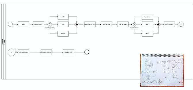
MVP

Flow
Design Exploration

Low-fidelity / Mid-fidelity Wireframes
I sketched each iteration and added the elements and screens necessary to reach users' goals, and added the annotations for each screen with the number that comes first to see which ideas worked best quickly. I converted the sketches into Balsamic to build an interactive prototype and tested some user stories with three different individuals.
I add options for student discounts and disability assistance options from my finding from users and the lock rate option into the first versions of a wireframe.

Testing
I turned my revised sketches into a black and white interactive prototype done with Sketch. I defined UI elements, design patterns and visual hierarchy. I tested the prototype in-person and remotely.
The outcome was generic, but few were very interesting. It was also a challenge to Lock rates specifically, where most of the users wanted to “SAVE MONEY.”
Designing solutions
Defining design
I started to put up things together with the findings, which is good to have and start solving the problem by designing screens and adding Iterations & adjustments.

Senior citizens and
Discounts
Added senior option to have options for direct calling feature and share location option to be picked from the correct location.
The added discount option was also added for users to know the new scheme and discounts that can avail.

Locking rates
We designed a flow in which the users frequently travelled location will get locked, and the user will get benefited by availing cheapest rates at high demand hours. Kindly see 8 and 9

Car options and
payment
Users have the freedom to choose cash or card at the time of booking itself to change the payment method. As it required a lot of digging, therefore, a swipe option has been added for convenience.

Sharing details
Users and driver were annoyed therefore we came up with radar option where users will be notified beforehand so that they can get prepared for boarding and driver will be notified if the user has changed its position. 13

Location details
Users and driver were annoyed. Therefore, we came up with a radar option where users will be notified beforehand to get prepared for boarding, and driver will be notified if the user has changed its position.

Ride Summary
Users can rate drivers according to motivation, cleanliness for understanding the users experience without writing a long complain or searching within lots of questions.

These were some major learnings or points we wanted to call out.
Simplicity is strength.
As a designer, we are often lured by attractive, trendy and out of the box designs. But, We must always remember the ‘why’. The primary goal is to understand the user, their problems and then come up with a design that solves them.
Prioritize
As a designer, we are often lured by attractive, trendy and out of the box designs. But, We must always remember the ‘why’. The primary goal is to understand the user, their problems and then develop a design that solves them.
Social
As a designer, we are often lured by attractive, trendy and out of the box designs. But, We must always remember the ‘why’. The primary goal is to understand the user, their problems and then develop a design that solves them.